By Sandy Parks
Everybody wants a website that is easy to use and effective as a sales or information tool. All these things are within easy reach whether you do your own, have someone do it for you, or a combination of both. All of it depends on your technical abilities and knowing what a good website requires. Having designed several websites, I’ve put together a list of my top eleven tips for an effective website for authors.
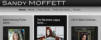
1. Make sure your name and what you do (author, writer, cover artist) are across the top, in an easy to read font, and against an eye-catching background. The header above with Sandy Parks has “Author” in the header. On the header below for Sandy Moffett, I waited and put the info as a header in the first column to the left. Why the left? In a responsive or mobile ready site (ie. your cellphone), your left column is usually the one seen first.
2. Have simple clean navigation on
every page and even at the bottom if it works for your site. You should be able to reach all the pages on a website from any page on the site. That also goes for your blog. Many times I have left a website to check out an authors blog and then can’t find a link back to the website or vice versa. I leave frustrated and they’ve lost a potential fan/sale. The header photos both have an example of a navigation bar that should be on all pages. This one is horizontal, but they can also be vertical. Some fancy sites even have a floating navigation box. Personally, I find them distracting, but others love the convenience. What is not obvious in the photos, is that on the website the navigation bars have more drop down choices when you roll a cursor over them. Too many choices on the main bar can clutter the page.
3. If you link to locations off your website (Amazon, blog, information, favorite authors), those should open in a new window so viewers can easily
tab back to your page (not using back arrows). When you add links in most programs it will ask if you want to open on a “blank” page or in a “new window.” Answer yes, and your link will open a new tab and window on your search engine. Easy. Try out this link to
Anne Marie Becker’s website and see if it opens in a new window (but please come back for the rest of the tips).
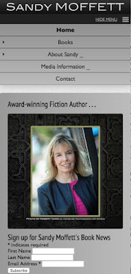
4. Make your website compatible with mobile devices! This is extremely important as Google and likely other search engines are giving ranking priority to “mobile ready” or “responsive” content. What does this mean?
If you search for your website on your phone or tablet, the columns should automatically condense to one or two columns (as in the photo to the left). For example, if you have a three column site, it should realign to one long column for those reading on a smart phone. Or perhaps two columns for ease of reading on a tablet.
5. Also important with a MOBILE compatible website is the navigation when in mobile configuration. It should show at the top of the window at all times, rather like when viewing Facebook or Twitter on your phone. The screen shot below shows three small bars in the upper right, and the selections that would normally be across the top of a wider website are now stacked up and still accessible. I’ve clicked on Books & Writing so submenus are visible (in light blue). You can also hide the menu’s to see more content.
6. Have a Newsletter Signup on the FIRST PAGE, not the Contact Page. Some viewers never click on the Contact page and thus will never see your sign-up notice/link/form. You can see an example in the photo above. Mine links to MailChimp, but there are many sites/methods which can help collect the information. Many successful authors will tell you these lists of readers can make or break their sales.
7. Add Twitter feed (example below). It updates your website whenever you post on Twitter so search engines note your site is active and that helps keep it visible to searchers. You can find the information on how to add it from the Twitter site.
8. Place links to buy books at every available vendor on every page where that book is mentioned. This is not as easy as you think. On my websites books are mentioned on the home page, a separate book category page, and a separate book excerpt page. There are places where I have added new book material and have yet to add a link. That’s why I also keep a website To Do list. When you add links they should include your affiliate link for the vendor. That is another source of income for an author whether indie or traditionally published, so check it out if you haven’t set up an account with a vendor. If you use icons for the vendors on your website, you should double check if the vendor has a required style. Several of the ones on my site need to be updated to reflect recent changes.
9. Your most recent book cover, if not more, should be displayed on the HOME page. The whole purpose of your website is to encourage sales and make the title of your book and your name familiar to the person stopping by.
10. No flashing, twinkling, constant motion on your site. These type things can be terribly distracting and actually drive people away (music is also a touchy subject and not recommended). Photo or banner rotators are fine if they are set to move or change slowly and have professional content (photographs that relate to subject, book covers, etc). You can also have some quick initial or introductory motion, but once people are on the sight and looking at content, that should be it. For example,
Julie Moffett wanted something geeky for her website (about a geek sleuth) so she has motion as you load the site and particular pages.
I could go on and list many more examples, but have to do some website tweaking of my own. So I’ll close with this last tip.
11. Check out all your links and other things on your site once in a while, especially after adding new content and updating the old.
Hope these tips help. You can check out my less than perfect website at
Sandy Parks or
Sandy Moffett. I’d also love to hear your website tips or opinions.
Source: Not Your Usual Suspects


